Historic population trends

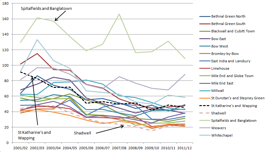
Another day, another statistical release, this time providing some longitudinal data over two centuries on London's population.

This first chart shows how London's population has grown and developed since 1801, growing from just shy of 1 million to 8 million. What is of particular interest though, is how this growth has not been in central London, but in the 'rest of inner london' during the 19th Century, with the greatest population growth (or shift) in the 20th century being in outer London


Indeed, at the beginning of the period, about 85% of 'Londoners' (though those not living in central London might not have considered themselves as such) lived in inner London, with 40 % of the population living in Central London, yet today less than 10 per cent of the population live in central London, with a broadly similar number of residents as in 1801.


If we look at the borough level, we can see that LBTH (light orange), Westminster (light green) and Southwark (light purple) had the largest populations in 1801 and continued to grow until the 1870s (Westminster) or the 1900s (LBTH, Southwark). Particularly striking was the flatlining in population in The City,  until the 1850s and then a period of continual shrinking of population, which has remained consistently low since the 1950s.


What I find quite interesting is the clustering of populations of individual boroughs in the post-war period, perhaps as a result of post war building projects, or perhaps simply expansion and spreading of populations as population densities decreased with improved living conditions.

In Tower Hamlets, populations peaked in 1901 and declined until 1981. I had assumed depopulation in Tower Hamlets was due to the closure of the docks post-war, when in fact, the majority of the depopulation occurred in the first half of the 20th century. By 2011, the population in LBTH had recovered somewhat, but was only as great as in 1951.
Indexing the data, so that for all boroughs 1801=100, we can see the significant divergence in population change. Brent (green-blue) has seen massive population growth, whilst for a number of boroughs, growth has come in the post war period.


Plotting the same data using a logarithmic vertical axis we can see some of the variation in population growth slightly better, with The City showing its population decline over the period.


When it comes to looking at the rate of growth in number of dwellings built since 1961, the average growth has been about 40%, except in The City (Dark Blue), wher there has been a quadrupling of dwelllings, suggesting that at least for a handful of people, that living in The City has been desirable, whilst all other boroughs have increased their housing stock at a broadly similar rate. [The chart below shows the number of properties, indexed to 1961]


Crime rates in St Katharine's and Wapping 2012-13

Having seen a few tweets about Wapping having the lowest crime rate in London, I was somewhat dubious, having looked at the data a few months ago when I wrote some earlier posts. This was further compounded when I looked at the Metropolitan Police's crime map, and I could readily identify wards with less crime (expressed as crimes per 1,000 residents). I even went as far as manually combining monthly extracts and even extracting the most recent raw data from the API using a script and some hard work, which still confirmed my suspicion. Per Randy Newman's lyrics to the theme for 'Monk', my catchphrase tends to be 'I could be wrong now, but I don't think so'.

So, when the final combined figures for 2012/13 for all wards in London were published this week, I downloaded them with some trepidation. It transpires that actually, (please remember I am a humble man!) against the odds and my expectations, I was infact correct ('nobody likes a smart arse' as @potoft often reminds me - alas she doesn't have her own theme tune).

There are 625 wards in London, and StKats and Wapping is ranked as the 402nd lowest crime area in London, or is that the 223rd highest? These stats don't include ASB, but I don't expect a massive dash up the table were ASB to be included (if I knew about football I presumably could make a football reference here. Note to self: get a life and adopt non-spreadsheet based manly pursuits).

However, I'm happy with mid-table mediocrity (I could be pundit after all!) - our crime rate is 88.8 per thousand residents, and the average for all of London is 95, so not too bad (though this average is affected by the West End, which is a different fish). For inner London wards, St Kats and Wapping's rate is in the bottom third, but then Shadwell's rate is only 73.4 and Surrey Docks is 70- perhaps its time to expand the boundaries of Wapping?

One good bit of news is that the figues show that crime fell slightly from last year, continuing the downward trend over 11 years.

Programme Review: The Bloody Ballad, Soho Theatre


Lovingly borrowed from Gagglebable
More of a handbill than a programme proper, but having enjoyed the artwork and the show, thought it deserved a quick mention. Printed on a single sheet of A4 (4 sides of A5), this rather nicely designed package were scattered over the cabaret tables in the Soho theatre, so

I was very impressed by what is essentially a fringe production investing the time to actually make a meaningful attempt at providing the audience with a little information in a nicely designed package.

The front is a photo montage paying homage to B-Movie posters of the 1950s, with a sci-fi feel to it. Despite the bloody hand it's a quite subtle and effective advert for the play with almost all of the main elements of the show included, though some of which are only apparant when you study it in detail.

Content wise, the back page is the cast list, inside front page is mainly blurb about the theatre company, inside back page lists the dates of the show, a few excerpts from reviews and a nice block of text on the genesis of the play. One little bonus is the inclusion of the chorus form the final song (useful if you're inclined towards audience participation).

Overall this a strong 4 star, it's free, it's printed in colour and it has strong design. Pushing out the boat and commissioning a painting for the front to be completely true to B-Movie posters would have made it 5 stars, as would a little bit more bio on the cast and creatives, the space taken up on the tour dates and review quotes is perhaps wasted in a programme, but this is more of a flyer so is unfair to criticise.

As for the show itself - a decent 4 stars - there were a few issues with mic stands, and random noise pops that meant it wasn't as slick as it should have been on the night, but at £15, it's a bargain. I'm a big fan of murder ballads and disaster songs as well as blues and rock n roll, so I rather enjoyed it. It starts a little slow, but the tension and pace rachet up towards the end.  Combined with  the range of Adnams beers you can drink during the performance, it's a great night out. If you don't catch it in London, it's reappearing at the Edinburgh Festival and would be well worth a diversion (regardless of beer selection).

Once you've been to see the show, or if you can't make it, you can download the songs on bandcamp or watch the whole show online.

What price for a gold medal?

As I eat my lunch, I often have a browse of the FT data blog, ONS, data.gov.uk or the London datastore. Last week I had a look at the data on Olympic tickets sales and wondered what if any interesting patterns in the data there were.

I decided to build a little model to understand how different factors affected the average price of a ticket sold to the public. Unfortunately the data is incomplete in some sports (boxing, wrestling and gymnastics) as there hasn’t been full disclosure on the relative number of tickets sold to the public rather than corporate sponsors and for some events (road cycling), the comparison is affected by possible attendance for non-ticket events.

So the steps to estimate the cost of the average ticket coming out of the model are:
(A)  multiply the number of people attending (proxy for capacity) by -0.000044
(B)  multiply the % of tickets sold to the public by -1.18
(C) Decide if you want to see a medal event, if so, add £65.
(D) Choose your sport from the table below
(E)  Predicted ticket price is calculated by A+B+C+D

Athletics
 £  220.26
Cycling Track
 £  145.15
Diving
 £  168.33
Equestrian
 £  141.69
Hockey
 £  129.91
Swimming
 £  148.11
Synchro
 £  123.92


This is obviously a very simplistic model that only considers 4 factors – capacity of stadium, how much is given to the public, whether a medal would be won and the sport itself. The results seem quite intuitive – but there is an issue in that sports are only played in one stadium, and the capacity may be partially determined by either the assumed popularity or demand for tickets, or the physical constraints of the space. Comparing an event in stadium with 10,000 seats compared to one with 80,000 seats only affects price by £3, so this doesn’t seem to be a significant factor in its own right. Ultimately the analysis is useful, but direction of causality is difficult to assess.

What is perhaps more interesting is when looking at some descriptive statistics - in this case the average price of a public ticket in different sports and then looking at the premium you would have had to pay for seeing a medal being won - basically you're looking at paying at least 50% more on average and the average across all sessions of sports was £93.

No medals
Medal
Premium
Medal mark up
Athletics
87
235
148
170%
Cycling Road
13
24
12
96%
Cycling Track
71
164
93
132%
Diving
85
154
69
82%
Equestrian
56
104
48
85%
Hockey
41
70
29
72%
Swimming
67
167
100
150%
Synchro
47
72
25
53%


And now for a message for our corporate sponsors:

Looking at the number of extra tickets that sponsors and dignataties received, we can see that there was a greater number (and proportion) of tickets given to 'clients' at medal events. In the non-medal road cycling events, only 1 per cent of those with tickets (ie in a grandstand) were corporates, but this jumped to 25% in the medal events. In the main stadium, an extra 7,931 seats were taken up for sessions where medals were won by corporate guests.

I appreciate the need for corporate sponsors and dignataries to be given tickets, but when one can see that in track cycling and swimming more than half of the spectators were there because of who they were.
 
Non medal event
Medal event
Extra tickets to corporates
Athletics
15,203
23,134
7,931
Cycling Road
59
766
707
Cycling Track
2,179
2,264
85
Diving
2,719
3,677
959
Equestrian
3,893
5,109
1,216
Hockey
2,880
4,919
2,038
Swimming
4,589
6,090
1,501
Synchro
2,476
3,059
583


Non medal event
Medal event
Additional % of crowd on a jolly
Athletics
24%
37%
13%
Cycling Road
1%
25%
24%
Cycling Track
51%
54%
3%
Diving
27%
36%
10%
Equestrian
19%
27%
8%
Hockey
21%
35%
14%
Swimming
39%
55%
16%
Synchro
20%
24%
5%

One final thing - 76 sessions had no medal events and 46 did- this is a split of 62%:38%, but when the total revenue generated is calculated - 64% of all revenue from these events came from sessions with medal events, and half of all revenue from the above events came from athletics medal events, so charging a premium, clearly helped out financially. Others might ask if non medal events were subsidised, though the accessibility of the games to paying members of the public is another matter.

The trouble with averages - Anti-social behaviour

Last week saw the publication of at least two news stories on anti-social behaviour (ASB) in local news papers (The Wharf and East London Advertiser) based on a Tower Hamlets Labour Party press release (here) and even saw the creation of an infographic!

Jim Fitzpatrick used FOI requests and parliamentary questions to obtain the data. I on the other hand just used the freely available data published by the police nationally and didn't trouble anyone. I'm using data down at a ward/neighbourhood level, though more granular data is available.

The Wharf interpreted the data (ie press release) by stating that:
A total of 17,287 incidents were recorded by the police in the east London borough last year, putting it second, behind only Westminster City Council, home to the West End
The ELA went with:
Only Westminster had a higher rate of ASB than Tower Hamlets, with nightlife hotspots such as Soho accounting for many reports.
So far, so unoriginal. Looking at the data at a borough level is interesting, but hides massive levels of variation within each borough. Within Westminster, the level of ASB is significantly higher in areas around the West End than compared to say Bayswater, Belgravia, Marylebone and Regent's Park. If you were to strip out the figures for the West End, the ASB rate for Westminster would be 33 per cent lower.


Even in Tower Hamlets there are reasonably significant variations in ASB, with Bethnal Green South, Spitalfields, Weavers and Whitechapel having ASB rates that are markedly higher than other areas in the Borough, albeit to a less striking extent than in Westminster. These to my mind correlate broadly to key thoroughfares and areas of entertainment. However, I cannot conclude this without drilling down into the data, but the presence of high levels of ASB around Whitechapel Road, Commercial Road, Bethnal Green Road, Brick Lane and Spitalfields seems quite intuitive.

Contextualising by looking at a ward-by-ward level for both LBTH and Westminster, we can see that actually, ASB in the West End dwarfs anything in the East End. Other than being annoyed by drunks, I have never felt unsafe in Central London at night or in the day, but, ASB is clearly reported at a much greater rate than in Tower Hamlets, where I do sometimes feel uncomfortable, so we also need to consider the nature of ASB and how each individual instance affects people.


So what should we conclude? Jim Fitzpatrick is quoted in the press release as saying:
"These figures show there's a lot more work to do to ensure local people feel safe in their neighbourhood."
 From my perspective, the data doesn't show this. What it shows is that the level of reported ASB in LBTH is relatively high, but doesn't necessarily feed into making a statement about safety, or how perceptions of ASB varies across the borough. If there are key hotspots where ASB is focussed, individuals living near these hotspots may feel unsafe, but we cannot extrapolate this across a population of 200,000 people.

Both LBTH and Westminster have a similar number of reported incidents of ASB, yet Westminster has two and a bit times more reported crime as shown below. ASB may be annoying, and it may make people people unsafe, but we shouldn't overplay the issue when we can't understand what the data says, particularly when we think of the myriad offences that can be classed as ASB.


There used to be data on this issue, though alas the Government ended collection of National Indicators after 2010. What the last dataset to be published showed was that LBTH had the second highest perceived level of ASB, with 46 per cent of survey respondents having a strong perception of ASB, compared to 20 per cent in Westminster - yet both have identical levels of reported ASB, suggesting, that reported ASB is not the metric to measure people's perceived safety on.


One final note - from my previous research, we do actually know that crime decreased significantly over most wards in Tower Hamlets in the 11 years to 2012.


Online library borrowing courtesy of Tower Hamlets and the London Library Consortium

After having my library membership suspended for lack of use, I applied again for membership today, specifically to be able to borrow ebooks for my Nook (note that Kindle owners need not bother), to avoid the need to physically go to the library (I don't want to spoil the magic of going to get recycling bags).

When I got home, I logged on to the e-library website I was somewhat surprised by what was promoted on the front page.

'Cock tales' and 'Bedding Lord Ned' are just two of the 'immediately available' titles. I'm not a prude but I find the balance of books very interesting but disappointing in respect to their literary (or commercial) merit. I don't know whether this a matter of supply or demand, but it's a slightly more liberal selection that I expected. I do think that it might be sensible to include some form of adult content filter - a curious young mind is not being immediately drawn to works of high literature, or more importantly, age appropriate content.

I could of course be being unfair, so I may review one to see if there is a vein of literature which has hitherto been left unnoticed by me. 

One further observation - neither of the next two books for bookclub are available on the elibrary, and the only previous book I found was the out of copyright 'The Picture of Dorian Gray'.


Popular Posts