Showing posts with label Tower Hamlets. Show all posts

The trouble with averages - Anti-social behaviour

Last week saw the publication of at least two news stories on anti-social behaviour (ASB) in local news papers (The Wharf and East London Advertiser) based on a Tower Hamlets Labour Party press release (here) and even saw the creation of an infographic!

Jim Fitzpatrick used FOI requests and parliamentary questions to obtain the data. I on the other hand just used the freely available data published by the police nationally and didn't trouble anyone. I'm using data down at a ward/neighbourhood level, though more granular data is available.

The Wharf interpreted the data (ie press release) by stating that:
A total of 17,287 incidents were recorded by the police in the east London borough last year, putting it second, behind only Westminster City Council, home to the West End
The ELA went with:
Only Westminster had a higher rate of ASB than Tower Hamlets, with nightlife hotspots such as Soho accounting for many reports.
So far, so unoriginal. Looking at the data at a borough level is interesting, but hides massive levels of variation within each borough. Within Westminster, the level of ASB is significantly higher in areas around the West End than compared to say Bayswater, Belgravia, Marylebone and Regent's Park. If you were to strip out the figures for the West End, the ASB rate for Westminster would be 33 per cent lower.


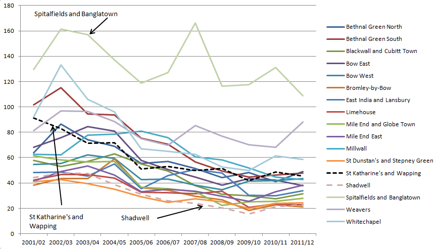
Even in Tower Hamlets there are reasonably significant variations in ASB, with Bethnal Green South, Spitalfields, Weavers and Whitechapel having ASB rates that are markedly higher than other areas in the Borough, albeit to a less striking extent than in Westminster. These to my mind correlate broadly to key thoroughfares and areas of entertainment. However, I cannot conclude this without drilling down into the data, but the presence of high levels of ASB around Whitechapel Road, Commercial Road, Bethnal Green Road, Brick Lane and Spitalfields seems quite intuitive.

Contextualising by looking at a ward-by-ward level for both LBTH and Westminster, we can see that actually, ASB in the West End dwarfs anything in the East End. Other than being annoyed by drunks, I have never felt unsafe in Central London at night or in the day, but, ASB is clearly reported at a much greater rate than in Tower Hamlets, where I do sometimes feel uncomfortable, so we also need to consider the nature of ASB and how each individual instance affects people.


So what should we conclude? Jim Fitzpatrick is quoted in the press release as saying:
"These figures show there's a lot more work to do to ensure local people feel safe in their neighbourhood."
 From my perspective, the data doesn't show this. What it shows is that the level of reported ASB in LBTH is relatively high, but doesn't necessarily feed into making a statement about safety, or how perceptions of ASB varies across the borough. If there are key hotspots where ASB is focussed, individuals living near these hotspots may feel unsafe, but we cannot extrapolate this across a population of 200,000 people.

Both LBTH and Westminster have a similar number of reported incidents of ASB, yet Westminster has two and a bit times more reported crime as shown below. ASB may be annoying, and it may make people people unsafe, but we shouldn't overplay the issue when we can't understand what the data says, particularly when we think of the myriad offences that can be classed as ASB.


There used to be data on this issue, though alas the Government ended collection of National Indicators after 2010. What the last dataset to be published showed was that LBTH had the second highest perceived level of ASB, with 46 per cent of survey respondents having a strong perception of ASB, compared to 20 per cent in Westminster - yet both have identical levels of reported ASB, suggesting, that reported ASB is not the metric to measure people's perceived safety on.


One final note - from my previous research, we do actually know that crime decreased significantly over most wards in Tower Hamlets in the 11 years to 2012.


Population growth - to infinity and beyond?

 Projections of population growth have recently been released for London boroughs with projections extending to 2041. Clearly, these are just projections, but I assume those responsible know what they're doing.

If we focus on LBTH's population, you can see that between 2001 and 2041, it is expected to double from 202,000 to 400,000, and half of this increase will have occured by 2017.

The population estimate for Tower Hamlets in 2013 is 270,000, which shows a quite substantial increase in 12 years.
Using this data we can calculate a compound growth rate, which for Tower Hamlets is 0.72% per year. However, if we look at the year-on-year increases in population, which I've plotted below, we can see that the largest proportionate increases are expected to have already occured between 20004 and 2011, with an gradual stepped decrease in growth rates indicating that the growth rate is expected to slow.


 However, the actual number of new residents will still be reasonably significant and will increased by between 7,000 and 8,000 each year until 2021, before dropping to 5,000 new residents per year until 2026 and then 3,000 per year until 2041. All of these new residents will clearly drive a need for improvements in transport, health and education infrastucture.

But, is Tower Hamlets different to the rest of London? The simple answer is yes. I've indexed the forecast populations of LBTH, Inner London and Outer London in the chart below to show the relative level of population growth. Whilst LBTH's population is expected to double (100 to 200 on the chart below), Inner London's population will only increase by 46 per cent and outer London by 32 per cent, so whilst all of London will be getting even more crowded, we may feel more of a squeeze in Tower Hamlets than elsewhere.


To contexualise this, in 2001, the population density was such that if everyone stood outside, and spread themselves out equally into a grid, there would be one person every ten metres. In 2041, this will have reduced to one person every 7 metres (and as a result each square actually halves in area from 106 square metres per person to 54 square metres a person).

Fire Station Closures


With the possibility of fire stations being closed, I thought it would be interesting to look at some of the issues that may be of concern to residents of Tower Hamlets.

The data I'm using is the London Fire Brigade's incident data for the period 2009-2012. For Tower Hamlets, this is just under 23,400 lines of data (one line per incident).
Read more »

Primary Schools for the Wapping catchment area

The first post in a series on the relative performance of schools in the local area. Here I begin by identifying the relevant primary schools I'll be looking into. In subsequent posts I'll look at their performance before moving onto secondary schools and borough-wide educational issues. Depending on availability I will include information on independent schools, but my focus will be on state funded schools.
Read more »

House price affordability in London

Can the average person afford to buy the average property?


A short post, but I thought it would be interesting to plot a dataset showing the ratio of median house price to median earnings onto a map to look at affordability.
Read more »

Wapping AKA Nappy Valley

Where did all the children go?


The 2011 census data has been coming out in drips and drabs and I thought I would continue my exploration of demographics of the East End with a look at population and age. What I found was a slightly odd lack of school age children.
The census data I'm using (from the GLA) is reported at a ward level and is broken down into bands of five years and if plotted we get the chart below. For reference the data here described as Wapping relates to the ward of St Katharine's and Wapping. What is interesting is that 6% of the Wapping population is age 0-4, but that this drops to 3-4% for the ages of 5-19 before increasing suddenly to 8% for those age 20-24. This is an interesting observation as it goes directly to the need for schools in the area.
Read more »

Well-Being in London

How Tower Hamlets compares to London in its well-being

You may have read about the government's attempts to measure the effectiveness of government policy through happiness, or more 'accurately', 'well-being' scores. Having looked at trends in crime, I thought I'd look to see how the local area comes out on this measure.
Read more »

Gritting Stuff

Modelling the weather is tricky, modelling cost less so
Read more »

Planning applications in Wapping


The trials and tribulations of attempting to drag Tower Hamlets into the open data age

Read more »

How to spend a penny in Tower Hamlets

Browsing through LBTH's FOI database to look for some interesting data to analyse I came across this request on public toilets in the borough.

 So thanks to this FOIer now we know that there are no public toilets in LBTH other than 15 automated cubicles. I would love to know what prompted this request!

Council tax bands of all residential properties in LBTH

My intention at present as hinted in my last post is to use the data out there to understand my local area, both the physical environment, demographics and other issues in society. Developing further the map in my last post, I've expanded it to cover the whole of Tower Hamlets and also incorporating details on different council tax bands.
Excuse my slightly shoddy legend implementation- I'm constrained on coding because of using Blogger as my platform rather than hosting my own pages, however it does what it's meant to do, though the colours appear off because the colours on the map are partially transparent.

The caveat

I'm using council tax bands as a proxy for value of property (which they nominally measure, albeit in 1991 terms). There are three main characteristics that I would assume determine value, being location, size and quality of the building, clearly, it is difficult to control for all factors. I have an FOI request out for the type of housing stock (flats/houses/maisonettes and number of bedrooms) from the Valuation Office Agency, though what data they will supply I don't know (I've asked for it by postcode but I imagine I will get it on a higher level).
Read the map based on the area of a given colour that is visible, not the area of the circle as a whole. Ideally I'd plot individual properties, but I don't think I will be able to obtain this level of detail.

Zooming in on the map gives a much better level of detail.

The (brief) analysis

Looking at the borough as a whole, there is a north-south divide in the distribution of properties between the council tax bands, though, perhaps most accurately, it is a waterside-inland split. One merely needs to follow the Thames from St Katharine Dock round to the Limehouse Marina and round the Isle of Dogs as well as along the various canals. I've noticed a few other pockets of higher value properties which appear to occur in areas with a number of period properties, such as Spitalfields (though of course centrality will have a big impact), Columbia Road and around Sidney Square.
In Wapping, there is a larger number of properties rated band D and above, though there is a swathe of greens and yellows driven by the Greenbank estate and over towards Prusom Street. Whilst it is inaccurate to label band B & C properties as 'low value' (properties on the Greenback go for c.£250-£300k), but the council tax banding gives an indication of relative value and it is striking that there appears (at least graphically) that the relative value of properties is heavily determined by location.

One last note, the map shows nicely that the last undeveloped spot with respect of residential property in the Wapping area other than the parks and the John Orwell centre is...the News International site. What value people put on its future properties is yet to be discovered.


A B C D E F G H

A B C D E F G H

But Sir, when will I ever use cosine?

The backstory...

I can't remember if anyone ever asked what the point of trig is in my maths lessons. This is possibly because it was so long ago, but mainly because I was a swot and was glad to be finally unleashing the power of my scientific calculator and was getting on with some maths.[1]

Other than thinking about trig when watching the Jeremy Brett adaptation of the Adventure of the Musgrave Ritual (spoiler alert) [2], I don't really think I've actually used it since school. So, when my passion for planning flared up and I started thinking in some depth about what was actually around me, I hadn't expected to fall into a rabbit warren of maths.

Last Saturday afternoon, having returned from a planning consultation on the News International site, and whilst my wife was asleep on the sofa, I did what any man would do. I submitted an FOI request to my local council LBTH, asking for details of how many residential properties were in the borough, which postcodes they were in, and which council tax band they fell into.

The quest... (or the boring bit)

I had been tinkering on google fusion with creating maps from data tables, and I had it in my head to use the fruits of my FOI request to plot this information. My aim was to create a map with circles (whose area related to the number of properties) centred on each postcode in the area. However, I discovered a number of issues:
  1. LBTH likes to supply data in PDF format, requiring you to copy and paste from the pdf and then reformat the data into a table.
  2. LBTH like to keep you on your toes by leaving out postcodes - fortunately I noticed that my previous two postcodes were not included and went back to them.[3]
  3. Google Fusion does not readily accept postcodes without additional information such as the city and country associated with them, much preferring longitude and latitude to be supplied.
  4.  KML, the XML type language that is widespread for geographic data (and supported by Google Fusion) does not have a function to draw circles.
  5. I cannot code.
Points 1&2 were easy. 3, was ok - I initially downloaded a dataset from the Ordnance Survey that only had them based on OS National Grid references, a few google searches later found a link to the data with longitude and latitude. I could have applied a transformation onto the OS northings and eastings to convert them, but that sounded a bit too dull. 4. Was a bugger, and 5 is a fundamental failing of someone who wants to manipulate and present data on the web.

I'll go into the detail of the mechanics in a later post, but basically I needed to approximate a circle by drawing an icosagon, or 20 sided polygon, which required me to work out where the vertices would need to be relative to the position of the postcode and what this would be in longitude and latitude. Here comes the trig, what it took me a long time to realise was that a) trig functions on computers don't do degrees, they do radians b) once you've worked where the relative point is in radians, you need to convert it back to degrees and c) you need to plot vertices anti-clockwise in KML. All of which is simple, until you have to work it all out by trial and error, and frustration why nothing appears on your map, except a big close up of the Indian Ocean.

Eventually I did work it out and manipulated the data in Excel, as I'm not quite ready to start using google's API's, writing my own javascript or any such nonsense.

The end result (sort of)

So, the finished product. At the moment it includes only postcodes starting E1 in Tower Hamlets... , so includes E1, E1W and E14. This will be amended - this intial set of postcodes was done as a quick filter to makesure my formulae were correct in Excel before risking trying to geocode a failed attempt again (one failed attempt, when I forgot to adjust part of my formulae from radians back to degrees took two hours to geocode a relatively small number of points). Once it worked, there is no geocoding, it just does it.

At the moment, a property is assumed to be 64 square metres in area (I guessed that a modest two bed property with lounge-kitchen would fit in an 8x8 floorplan, though on subsequent checking the latest development in Wapping, 21 Wapping Lane states that their 'typical' two bed flat is 80 square metres, whereas a one bed is 48 square metres), such that the area of the circle is 64*number of properties. The next iteration will hopefully also map the relative proportion of properties by council tax band using concentric rings!

It surprised me that the circles weren't overlapping left, right and centre, particularly in residential areas, which suggests that there is more space (even if it is just a carpark or communal garden) than I might have expected. However, this may be an issue with my assumption on land usage. BTW the really big circle in the North East is the new Nido halls of residence in Spitalfields


Coming up next...

  • The same map, updated for all LBTH postcodes and the composition of bands 
  • A map showing overall density of different areas of Wapping and neighbouring boroughs
  • An analysis of vacant properties in the area
     

Notes

[1] I had a misspent youth.
[2] Alas the last time I think I read the story was pretty much when I should have been studying for my GCSE maths - I had a very misspent youth.
[3] I should say that LBTH were very prompt and provided data on Tuesday, my wife exclamining 'they do know they've got another three and a half weeks to deal with that?' when I told her.
 

Popular Posts