The Great Gatsby holds a special place in our house for being one of the shorter novels we own (and thus appreciated for not taking up precious shelf space). I thoroughly enjoyed the book, and its short length makes it an ideal candidate for stage adaptation. Everything I’ve seen on twitter about it has been positive, so I was pleased to have the opportunity to see it, but would it live up to the hype?
Read more »

A taste (or a sip) of Wapping
A week last Friday, I found myself in Victualler with 6 other residents of Wapping, collectively labelled by WiW Vickie as the Wapping bloggers (and their support teams).
I've been in Victualler several times, normally to buy a bottle of kernel beer to take home and the odd bottle of wine for a gift, but have never sat in, indeed the last time I'd sat in that unit was for a tweet-up in the days of James Wallace Wines.
Read more »
Creating maps in Excel pivot tables
When I can't be bothered doing something because it's too much hassle, I like to find a work around and data analysis is no different. When I was looking to plot fire brigage data onto a map, I faced having to convert 23,000 coordinates from the Ordnance Survey National Grid into the cartographic map projection used by google maps if I would be able to plot them without buying some fancy pants GIS software. Using my knowledge of MS Excel, I was able to achieve exactly what I wanted to in less than five minutes.
Read more »
Modelling fire brigade responses
In my last post I explained some of the processing of the London Fire Brigade incident data. In this post I look at the actual data and begin to consider what the impact of the proposed closure of Bow Fire Station.
Mapping the impact of fire station closures: methodology
This post sets out my methodology for modelling the potential closure of fire stations. The actual analysis will be included in my next post.
Read more »
Language of Learning
To try and understand the 'Nappy Valley' phenomenon, I have been looking at data on the schools in the area. One of the data fields I have, is the proportion of school pupils for whom English is not their main language.
From the census I know that 34% of residents in Tower Hamlets do not think of English as being their main language, so I was a little surprised that 77.5% of pupils in Tower Hamlets state primary schools do not speak English as their main language- this is over twice the level of the general population. In St Katharine's and Wapping ward in 2011, 72% of the population speak English as their main language, yet in the schools (albeit a slightly wider area), only 20% of children speak English as their main language.
Read more »
Fire Station Closures
With the possibility of fire stations being closed, I thought it would be interesting to look at some of the issues that may be of concern to residents of Tower Hamlets.
The data I'm using is the London Fire Brigade's incident data for the period 2009-2012. For Tower Hamlets, this is just under 23,400 lines of data (one line per incident).
Primary Schools for the Wapping catchment area
The first post in a series on the relative performance of schools in the local area. Here I begin by identifying the relevant primary schools I'll be looking into. In subsequent posts I'll look at their performance before moving onto secondary schools and borough-wide educational issues. Depending on availability I will include information on independent schools, but my focus will be on state funded schools.
Read more »
Read more »
Nappy Valley 2
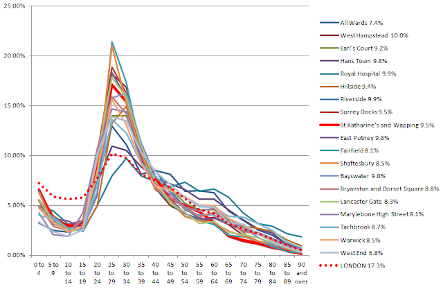
I was looking at the population structure of Wapping compared to LBTH, and London. I thought it would be interesting to identify other wards with a similar demographic structure to Wapping to see what shared characteristics there might be as part of my quest to understand the Nappy Valley situation.
For all London wards I calculated the proportion of the population that was a school aged child (5-19). A few statistics of note:
However, just because these areas all have relatively few school age children doesn't mean they're similar - it could be that they have a very large number of pensioners for example, skewing things, so I plotted a chart:
 I tested the goodness of fit of Wapping against this subset using categories of 5-9,10-14, 15-19 and 'other' to see if the profile of young people is consistent. This gives a p value of 0.063, which in simple terms means that at the 95% confidence level that these other wards are a good fit with Wapping.
So next stage is to start understanding what it is that is a) driving the exodus and b) pulling in the youngsters, and then find out if the wards I have identified have anything in common - looks like I best get some datasets out!
For all London wards I calculated the proportion of the population that was a school aged child (5-19). A few statistics of note:
- Taking the average of 625 wards gives an average school age proportion of the population to be 17.1%
- The median proportion of the population that are school age is 17.4%
- If you take the population of London as a whole, 17.2 percent of the population are school age.
- The highest is 27.8% (Fieldway in Croydon)
- The lowest is 6.8% ('West End' in Westminster)
- Wapping at 9.5% is in the second percentile (i.e. 98 per cent of wards have proportionately more children)
| City of London | All Wards | 7.4% |
| Camden | West Hampstead | 10.0% |
| Kensington and Chelsea | Earl's Court | 9.2% |
| Kensington and Chelsea | Hans Town | 9.8% |
| Kensington and Chelsea | Royal Hospital | 9.9% |
| Merton | Hillside | 9.4% |
| Southwark | Riverside | 9.9% |
| Southwark | Surrey Docks | 9.5% |
| Tower Hamlets | St Katharine's and Wapping | 9.5% |
| Wandsworth | East Putney | 9.8% |
| Wandsworth | Fairfield | 8.1% |
| Wandsworth | Shaftesbury | 8.5% |
| Westminster | Bayswater | 9.0% |
| Westminster | Bryanston and Dorset Square | 8.8% |
| Westminster | Lancaster Gate | 8.3% |
| Westminster | Marylebone High Street | 8.1% |
| Westminster | Tachbrook | 8.7% |
| Westminster | Warwick | 8.5% |
| Westminster | West End | 6.8% |

There appears to be a strong visual correlation between these wards with perhaps the exception of 'Hans Town' and 'Royal Hospital' which show less of a spike in young adults, but do show the same lack of children (as is expected given the basis for selection). However, looking just at the school age section, we can see these wards are all tightly packed, though some don't show the same steep drop.
 I tested the goodness of fit of Wapping against this subset using categories of 5-9,10-14, 15-19 and 'other' to see if the profile of young people is consistent. This gives a p value of 0.063, which in simple terms means that at the 95% confidence level that these other wards are a good fit with Wapping.
I also looked at what I will refer to as the 'drop-off', that is, the percentage drop in the number of the population aged 5-9 compared to aged 0-4:
- Median drop-off is 17.9%, average is 17.2
- Wapping is in the top 1.3 percent in London with a drop off of 45.5%
- Looking just at Tower Hamlets, there are 3 Wards - Wapping and the two Isle of Dogs wards, which have a much greater level of drop-off
So there appears to not only be fewer children, but that there are fewer school age children compared to the number of toddlers.
| Drop-off | |
| St Katharine's and Wapping | 45.5% |
| Millwall | 40.9% |
| Blackwall and Cubitt Town | 33.9% |
| Bow East | 23.0% |
| Spitalfields and Banglatown | 18.3% |
| Bow West | 17.7% |
| Limehouse | 17.6% |
| Shadwell | 17.5% |
| Whitechapel | 17.0% |
| Mile End East | 10.8% |
| Weavers | 9.6% |
| Bromley-by-Bow | 9.1% |
| Bethnal Green South | 8.8% |
St Dunstan's and Stepney Green | 7.4% |
Mile End and Globe Town | 3.3% |
Bethnal Green North | 3.2% |
East India and Lansbury | -2.7% |
So next stage is to start understanding what it is that is a) driving the exodus and b) pulling in the youngsters, and then find out if the wards I have identified have anything in common - looks like I best get some datasets out!
The cost of renting privately in London
I was reading an article (Rents shock for East End Families facing three-times average rises) in the East London Advertiser on the soaring cost of renting, which itself was based on a report by shelter (here) and I was curious where the figures came from and whether the reporting could have captured a more nuanced analysis.
I found that whilst average rents are increasing, the private rental market is two-speed, with large increases in rent for both the cheapest and the most expensive properties, but not the 'average' property, however the quality of the data doesn't allow us to make any definite findings and the article by the ELA is not as convincing once one understands the limitations of using this data on a local level.
What we can say:
- Saying the average rent went up by 6% is meaningless
- We don't have long term data so we don't know if this is a blip
- We aren't comparing properties consistently or even referring to the same population
- The median rental price hasn't increased significantly other than for single rooms and properties with 4+ beds
- The rent charged for the cheapest and the most expensive properties are increasing in price more quickly and at quite high rates
- The 'mean' rental payment is greater than the median, indicating that the 'average' rental price paid is skewed by the most expensive rents.
- All of the above is dependent on the robustness of the VOA's sampling methdology at a local authority level.
Analysis
We know the 'average' increased by 6%, but what about other measures? The median is largely unchanged except for the very largest and individual rooms, though the two might be linked (house shares presumably are more economically viable in larger properties), though of course it's not possible to say. So we know that for everyone other than those living in large houses or renting a single room, the man in the middle isn't experiencing an increase in their rent.
However, for studios and 1,2 and 3 bedroom properties, the lower quartile (LQ) increased in value at a greater rate than the median, indicating that those who are in the cheapest properties are experiencing rent increases.
Looking at the movement for the upper quartile (UQ), we again see that with the exception of 3+bed properties, the increase in the rent paid by UQ properties is increasing faster than the median.
What this suggests is that the cheapest properties and the most expensive properties are both experiencing greater than 'average' increases in rent. The trend in rooms is very interesting, as the greatest movement in price is in the upper quartile, which makes me wonder if people who might otherwise rent a studio or single bed property are switching demand to roomshares, which is pulling up the rent for 'premium' rooms.
TABLE 1: Summary
Mean | LQ | MEDIAN | UQ | |
Room | 10% | 9% | 13% | 17% |
Studio | 9% | 8% | 0% | 9% |
1 Bed | 5% | 4% | 2% | 6% |
2 Bed | 8% | 7% | 3% | 8% |
3 Bed | -1% | 6% | 0% | -6% |
4+ Bed | 11% | 7% | 10% | 9% |
Looking at TABLE 2, which shows the mean (or 'average') we can see that whilst the overall average rent has gone up by 6 per cent, there is quite a lot of variation by type of property. Indeed, for 3 bed properties (the sort of place a hardworking family might want to live) the average rent in this survey fell. However, it is not clear if there is something different about the market for 3 bed properties or if the data isn't strong enough.
TABLE 2: MEAN MONTHLY RENT (£)
2011 | 2012 | Change | |
Room | 480 | 529 | 10.2% |
Studio | 992 | 1,084 | 9.3% |
1 Bed | 1,218 | 1,278 | 4.9% |
2 Bed | 1,537 | 1,658 | 7.9% |
3 Bed | 1,903 | 1,878 | -1.3% |
4+ Bed | 2,166 | 2,406 | 11.1% |
All | 1,287 | 1,366 | 6.2% |
2011 | 2012 | Change | |
Room | 400 | 435 | 8.7% |
Studio | 802 | 867 | 8.1% |
1 Bed | 1,018 | 1,062 | 4.3% |
2 Bed | 1,257 | 1,343 | 6.9% |
3 Bed | 1,430 | 1,517 | 6.1% |
4+ Bed | 1,820 | 1,950 | 7.1% |
All | 1,018 | 975 | -4.3% |
TABLE 4: MEDIAN MONTHLY RENT (£)
2011 | 2012 | Change | |
Room | 459 | 520 | 13.2% |
Studio | 997 | 997 | 0.0% |
1 Bed | 1,170 | 1,196 | 2.2% |
2 Bed | 1,473 | 1,517 | 3.0% |
3 Bed | 1,733 | 1,733 | 0.0% |
4+ Bed | 2,167 | 2,383 | 10.0% |
All | 1,300 | 1,322 | 1.7% |
TABLE 5: UPPER QUARTILE MONTHLY RENT (£)
2011 | 2012 | Change | |
Room | 520 | 606 | 16.5% |
Studio | 1,192 | 1,300 | 9.1% |
1 Bed | 1,387 | 1,473 | 6.2% |
2 Bed | 1,712 | 1,842 | 7.6% |
3 Bed | 2,145 | 2,015 | -6.1% |
4+ Bed | 2,383 | 2,600 | 9.1% |
All | 1,603 | 1,668 | 4.0% |
Caveat on data
The data that the anaysis is based on has some quite significant weaknesses. It is based on a survey undertaken by the Valuation Office Agency, a government body; but the survey doesn't track properties year-on-year, so the utility of the results are dependent on the sample being representative of the housing stock year-on-year.As an indication that the selection criteria appear not to target a given location proportionately we can look at the number of properties surveyed in different areas and how these changed over time; for example, 42 per cent fewer properties in LBTH were surveyed in 2012 compared to 2011 (1,628 vs 2,787), in contrast Lewisham saw a 5 per cent increase and in London as a whole, the dip was only 18 per cent, indicating that the likelihood of a given property being surveyed is not equal.
Another issue is that the methodology includes houses and flats in the same bracket, so if the mix changes, the results will be skewed.
The Shelter report openly states that it chooses not to use the median as data 'clusters' around it. I personally find the median a very useful figure when performing analysis, because unlike the mean/average, it is based in reality - it is the middle value and gives an idea about how a distribution is changing. If all a large number of very fancy flats were built and attracted a large rent, they would incresase the average rent, but, the average tenant wouldn't necessarily be paying any more money, so we need to look at a number of statistics.
The Shelter report openly states that it chooses not to use the median as data 'clusters' around it. I personally find the median a very useful figure when performing analysis, because unlike the mean/average, it is based in reality - it is the middle value and gives an idea about how a distribution is changing. If all a large number of very fancy flats were built and attracted a large rent, they would incresase the average rent, but, the average tenant wouldn't necessarily be paying any more money, so we need to look at a number of statistics.
Subscribe to:
Posts (Atom)


