Showing posts with label tfl. Show all posts

A sure way to make money? Move Shoreditch 300m

Back when I first moved to the area, Wapping had an underground station and it served me well - Whitechapel for Sainsbury's in the north, and Surrey Quays for Tesco to the south. If I wanted to mix it up, I'd get the DLR to ASDA on the Isle of Dogs. At each extremity of the old East London Line were stations I never ventured to - Shoreditch, New Cross and New Cross Gate. Shoreditch was a bit odd, because I was pretty sure that trains ran there, but I was just never sure when, and as at the time we lived just north of The Highway (bad Wapping) we would just walk to the Brick Lane environs or get the 100 bus to Bishopsgate rather than walk to Wapping.

It may then seem churlish for me to care about the location of the replacement of Shoreditch Station - Shoreditch High Street station.

When TfL closed the ELL and gave us a phantom replacement bus service, I made a deal with TfL. I never told TfL this, but we had an unspoken arrangement. Part of that deal that I made with TfL in my mind about closing the ELL to extend it, was that I would give up the luggage racks and umbrella hooks of the old rolling stock in exchange for untold adventures that would be accessible to the north, in exotic places like...Brondesbury.

Shoreditch High Street
sneaks inside zone 1
Back when Red Ken was king, the idea of Orbirail was thought up - an orbital railway which would allow passengers to avoid zone 1 using largely pre-existing railway lines.

Well, that was the idea anyway. What actually happened was that someone got scared that extending the ELL would remove passengers (and thus revenue) from the South Central franchise operating out of London Bridge (currently operated by 'Southern'). As a result, Shoreditch High Street Station having moved 300m was required to be classified as being in zone 1 as a condition of DfT giving money to TfL for the extension. I'm not fully convinced by the logic of building infrastructure to provide additional capacity to alleviate overcrowding and then price it to ensure that it doesn't alleviate capacity constraints on the busiest part of the network as fully as it could, but this is by-the-bye.

The issue of Shoreditch's location in zone 1, is not new and has been discussed at length since 2009. Various campaigns were run to try and get it moved back to zone 2 but to little joy.

I almost always use 'pay as you go' (PAYG) on oyster, as my sporadic travel (such as walking to and from work) and holiday patterns means that a season ticket doesn't give me a clear economic benefit. So, whenever I touch in and out, I  keep an eye on my balance and how much is being deducted. Most of the time, I either stay within one zone, or go from one zone to another and I know how much these journeys will cost me. However, PAYG works on the basis of which zones you pass through, not just the start and end points. This is where the designate zone of Shoreditch High Street becomes important. All but one station on the Overground's circle is in zone 2 (Hoxton is in both).

I've done a table showing the various fares that you can be charged travelling between a few of the stations between Highbury & Islington, and Canada Water. Now, we know that all of the stations other than Shoreditch High Street are in zone 2. So surely, there are two journey types - zone 2 to zone 2 and zone 2 to zone 1 (which includes going through zone 1). This however is not the case. There are actually 4 fare types, three of which have differential pricing dependent on what time of day you travel.

Pay as you go fares for stations on the ELL


When travelling between stations which are south of Shoreditch, or north of of Shoreditch one pays £1.60 a journey in the peak and £1.50 outside of the peak.

Now, something slightly odd. If travelling from Wapping, Shadwell or Whitechapel to Shoreditch (we'll refer to these as the southern group shortly), one pays £2.10 for a single. But travel from Rotherhithe, it will cost you £2.40 in peak or £1.90 at other times. So people coming from south of the river pay a £0.30 premium in peak, but get a £0.20 saving off peak! The same relationship exists for stations between Dalston Junction and Hoxton (the northern group), compared to those further north.

And if you want to travel between what I've labelled the 'southern' and the 'northern' groups of stations? You pay £2.40/£1.90, but if you want to travel outside of these stations either side of Shoreditch, your fare jumps again, this time to £2.80/£2.10. [Update: TfL have informed me that the different pricing on these stations is due to it being a 'national rail' zone 1-2 fare rather than a standard TfL zone 1-2 fare]

What I'm trying to get across, perhaps very well if what I've just written isn't clear, is that TfL has successfully managed to make travel between these stations very confusing if you're on a budget. I've seen people who only keep the bare minimum on their oyster cards getting emotional at Shadwell when they discover that the zone 2 to zone 2 journey that they thought they were making and which they budgeted as costing £1.60 actually cost £2.80 (or 75% more than expected!) meaning that they don't have money to get home.

One way around this is to go on the Jubilee Line or DLR to Stratford and then take the spur of the Overground to Highbury & Islington, using the pink validator, but certainly during the peak, sharing a train with commuters to Canary Wharf doesn't necesarily make for the most pleasant journey.

The financial impact on Londoners

Having noticed these odd pricing patterns I thought I'd find out what the impact of Shoreditch High Street being in zone 1 was. So I submitted an FOI request to TfL which revealed:

  • A total of 7.3 million passengers board or alight at Shoreditch High Street.
  • A total of 9 million passengers pass through Shoreditch High Street station but do not alight.
  • An extra £7 m per year is generated by Shoreditch High Street’s location in zone 1 rather than zone 2
  • There is no plan to reconsider which zone Shoreditch is in

So. Passengers are paying an extra £7m a year on PAYG credit just to pass through a single station in zone 1. The actual cost to commuters will be even greater as people using travel cards will have been forced to pay for a travel card including zone 1, even if their start or end point isn't in zone 1.

[Update - a note of caution: I asked what the cost to passengers who pass through Shoreditch is, so I assume this is what the £7m is, but no details of the calculation were provided. I've asked for clarification on which passengers this relates to. However, even if it includes those alighting at Shoreditch, it's still likely to be significant]
What is key to this issue is the funding agreement with DfT: to obtain £24m to fund the extension TfL agreed to put Shoreditch in zone 1. So not only did TfL receive £24m free of charge from the government, they also get an additional £7m per year than had they stumped up the cash and done the logical thing of putting it in zone 2, or zone 1/2. I could understand keeping Shoreditch in zone 1 if the additional fares financed the extension, but in fact it just goes into TfL's coffers, punishing the residents of East London who seek to avoid the much more crowded underground.
Crime on public transport in London

Another day, another dataset.

Today's data is crime rates on the TfL transport network.

The data whilst published as one dataset is derived from two different sources -British Transport Police and the Metropolitan Police. The Met are responsible for bus related crime and BTP for rail (heavy and light, over and underground). The Met doesn't have  a category for bus crime, rather it runs various searches on crime reports for certain words, namely bus and bus stop, so may under or overstate 'bus' crime.

As with most crime data, we have the absolute number of crimes reported and the crime rate. The crime rate is expressed as number of crimes per million passenger journeys, so is not comparable to standard crime rates of 'crimes per thousand residents' which I refer to elsewhere.

I should also caveat that these figures are for ALL crimes, so in comparing the crime rate, we might find equal levels of crime on the bus and tube, but if all of the bus crime is theft whilst all tube crime is murder - I know I'd rather be on the bus, but from this data I wouldn't be able to make that call.

So, where to begin? I will be answering the following questions:
  • Has the overall level of crime changed across the network?
  • Has the crime rate changed across the network?
  • Which mode of transport is the safest?
  • Is my journey getting safer, more dangerous or the same?
  • Does the number of crimes increase with the number of journeys made?

Q: Has the level of crime changed across the network? A: Yes, the number of reported crimes has dropped.

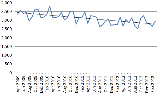
There was 11.6 per cent reduction in reported crimes on all forms of transport in March 2013 compared to April 2009 with the number of crimes reported in those months falling from 3,341 to 2,953. Annually (financial year) the number of crimes reported has fallen from  40,570 to 34,510, or a 15 per cent reduction.

Q: Has the crime rate changed? A: Yes, the number of reported crimes compared to the number of journeys has dropped.


Because there were changes to the integration of the Overground and measurement of journeys, the number of journeys for the Overground isn't available pre 2011 and a crime rate can't be calculated. In looking at the overall rate I have excluded overground crime pre April 2011, but included it for periods we do have.

Looking at the change in rate from April 2009 to March 2013, the rate fell from 12.1 crimes per million journeys to 9.1 per million journeys, a fall in the rate of nearly a quarter (24.5 per cent). If we exclude the overground completely, the reduction is slightly smaller 23.4 per cent.

Q: Which mode of transport is the safest?  A: Overground


Comparing crime rates at three points we can see that the Overground looks to be safest with a substantially lower crime rate.

However, these are for invidual months. Looking at all of 2012/13 the rates are:
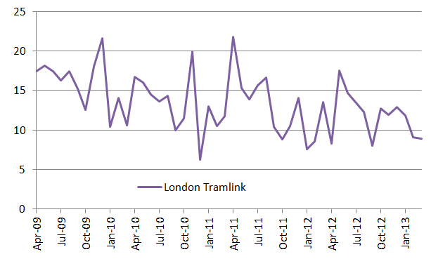
You can see the danger of using point measures of crime, as as we will see there is significant fluctuation in crimes, particularly on the Tramlink. However, because of the fewer journeys on both Overground and Tramlink, any fluctuation in the number of crimes affects the crime rate more.

Is my journey getting safer, more dangerous or the same? A: Most likely safer but depends

Looking at the number of reported crimes, there is a reasonably steady reduction in the number of crimes reported relative to the number of journeys. However, Tramlink is very erratic, but demonstrates an overall downward trend. The Overground experienced one large spike, but otherwise shows little evidence of a trend.


Calculating the crime rate over a rolling, three month period, suggests a marginal downward trend, but not conclusively. However, the Overground was the mode of transport with the lowest crime rate and as noted above, as significantly fewe people make journeys on it more susceptible to spikes.

Q: Does the number of crimes increase with the number of journeys made? A: Sort of yes. Sort of no. But probably yes

If one plots the number of crimes (y axis) against the number of journeys (x axis) for each of the four modes of transport, you basically get a cluster of points which shows relatively little evidence of correlation, with the exception of the Overground, where there is a decent relationship, driven in part by the relatively sharp rise in the number of journeys.

In part we have a problem that we know that the rate of crime is decreasing, even though the number of journeys are increasing, which is a result of both a) more journeys and b) less crime. Surely then, crime decreases with increased journeys? Well no. If you plot the data points for all four modes as a single series, what you get is an R square value of 0.96 - showing an incredibly strong link between the two.

In the chart below, you can see this relationship. In part, this apparant contradiction is because there is a certain degree of steadiness - neither crime nor journeys are that variable over a relatively short period.


So I bunged the numbers into a regression. Each month was coded 1-48 (April 2009 was 1, March 2013 48), so that I could control for changes due to reduction in crime as a factor of time.


The results of the regression are striking- R square of 0.99 and all of the p-values are very very low, suggesting the probability of a relationship being random for all variables unlikely. So, we know that crime is definitely going down with time (negative coefficient), but also increases with the number of journeys (positive coefficient) , and the resultant crime rates are affected by both factors.


Popular Posts