Showing posts with label London. Show all posts

Crime on public transport in London

Another day, another dataset.

Today's data is crime rates on the TfL transport network.

The data whilst published as one dataset is derived from two different sources -British Transport Police and the Metropolitan Police. The Met are responsible for bus related crime and BTP for rail (heavy and light, over and underground). The Met doesn't have  a category for bus crime, rather it runs various searches on crime reports for certain words, namely bus and bus stop, so may under or overstate 'bus' crime.

As with most crime data, we have the absolute number of crimes reported and the crime rate. The crime rate is expressed as number of crimes per million passenger journeys, so is not comparable to standard crime rates of 'crimes per thousand residents' which I refer to elsewhere.

I should also caveat that these figures are for ALL crimes, so in comparing the crime rate, we might find equal levels of crime on the bus and tube, but if all of the bus crime is theft whilst all tube crime is murder - I know I'd rather be on the bus, but from this data I wouldn't be able to make that call.

So, where to begin? I will be answering the following questions:
  • Has the overall level of crime changed across the network?
  • Has the crime rate changed across the network?
  • Which mode of transport is the safest?
  • Is my journey getting safer, more dangerous or the same?
  • Does the number of crimes increase with the number of journeys made?

Q: Has the level of crime changed across the network? A: Yes, the number of reported crimes has dropped.
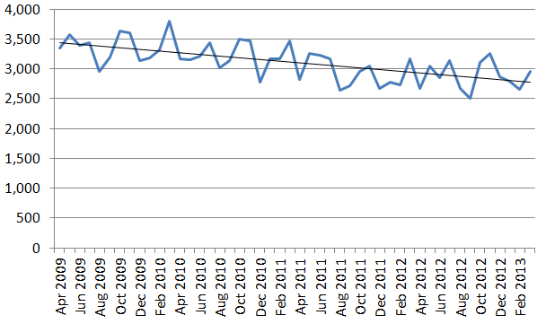
There was 11.6 per cent reduction in reported crimes on all forms of transport in March 2013 compared to April 2009 with the number of crimes reported in those months falling from 3,341 to 2,953. Annually (financial year) the number of crimes reported has fallen from  40,570 to 34,510, or a 15 per cent reduction.

Q: Has the crime rate changed? A: Yes, the number of reported crimes compared to the number of journeys has dropped.


Because there were changes to the integration of the Overground and measurement of journeys, the number of journeys for the Overground isn't available pre 2011 and a crime rate can't be calculated. In looking at the overall rate I have excluded overground crime pre April 2011, but included it for periods we do have.

Looking at the change in rate from April 2009 to March 2013, the rate fell from 12.1 crimes per million journeys to 9.1 per million journeys, a fall in the rate of nearly a quarter (24.5 per cent). If we exclude the overground completely, the reduction is slightly smaller 23.4 per cent.

Q: Which mode of transport is the safest?  A: Overground


Comparing crime rates at three points we can see that the Overground looks to be safest with a substantially lower crime rate.

However, these are for invidual months. Looking at all of 2012/13 the rates are:
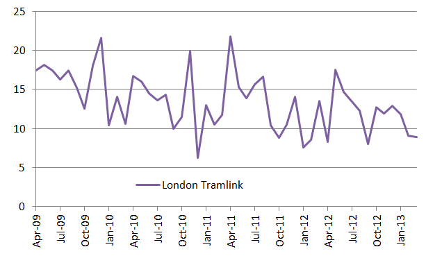
You can see the danger of using point measures of crime, as as we will see there is significant fluctuation in crimes, particularly on the Tramlink. However, because of the fewer journeys on both Overground and Tramlink, any fluctuation in the number of crimes affects the crime rate more.

Is my journey getting safer, more dangerous or the same? A: Most likely safer but depends

Looking at the number of reported crimes, there is a reasonably steady reduction in the number of crimes reported relative to the number of journeys. However, Tramlink is very erratic, but demonstrates an overall downward trend. The Overground experienced one large spike, but otherwise shows little evidence of a trend.


Calculating the crime rate over a rolling, three month period, suggests a marginal downward trend, but not conclusively. However, the Overground was the mode of transport with the lowest crime rate and as noted above, as significantly fewe people make journeys on it more susceptible to spikes.

Q: Does the number of crimes increase with the number of journeys made? A: Sort of yes. Sort of no. But probably yes

If one plots the number of crimes (y axis) against the number of journeys (x axis) for each of the four modes of transport, you basically get a cluster of points which shows relatively little evidence of correlation, with the exception of the Overground, where there is a decent relationship, driven in part by the relatively sharp rise in the number of journeys.

In part we have a problem that we know that the rate of crime is decreasing, even though the number of journeys are increasing, which is a result of both a) more journeys and b) less crime. Surely then, crime decreases with increased journeys? Well no. If you plot the data points for all four modes as a single series, what you get is an R square value of 0.96 - showing an incredibly strong link between the two.

In the chart below, you can see this relationship. In part, this apparant contradiction is because there is a certain degree of steadiness - neither crime nor journeys are that variable over a relatively short period.


So I bunged the numbers into a regression. Each month was coded 1-48 (April 2009 was 1, March 2013 48), so that I could control for changes due to reduction in crime as a factor of time.


The results of the regression are striking- R square of 0.99 and all of the p-values are very very low, suggesting the probability of a relationship being random for all variables unlikely. So, we know that crime is definitely going down with time (negative coefficient), but also increases with the number of journeys (positive coefficient) , and the resultant crime rates are affected by both factors.


London Cycle Statistics

TfL has aspirations of 5 percent of all journeys in London to be made by bicycle by 2020 and to his end they have installed sensors which detect bike movements. Little information is given on the nature of these measuring devices other than that they measure a distortion of an electromagnetic field.

TFL aren't publishing the actual number of bike journeys (as presumably there is no way to easily measure all bike movements) but have released indexed figures on a monthly basis. When I say monthly, It would be more appropriate to say on a four week basis, as TfL like for each reporting period to have the same number of days, so they have 13 reporting periods.

Looking at the data, it's clear that cycling is increasingly popular. The chart below shows the relative increase in cycling (ignore the scale, it's meaningless) for every year since 2000/01, with the number of bicycle journeys annually about two and a half times higher in 2012/13 than in 2000/01 - clearly a decent rate of growth.

Similarly, looking just at "period 1" (April 1-28) for each year we can see a steady upward trend - for year-on-year comparisons of individual "periods" there are blips, but its likely that weather affects matters.


However, if we plot the relative number of journeys in every 4 weeks "period", we can see there is significant seasonal fluctuation. What'ts more striking for me is that the variation appears to also be growing over time (if we look at the range between each peak and subsequent trough).


I applied a seasonal adjustment to try and iron out this level of variation to try and get a better idea of what the trend was and this is shown by the red line in the chart below. However, by applying this adjustment, I've actually increased the level of variation in earlier periods, as the adjustment appears to overcompensate. The two black lines on the chart are the trends for period 8 (October) - what I'm thinking of as the end of temperate weather and period 10 (mid December-mid Jan) which I think is a good marker for height of winter (shortest days, cold, wet etc).

Looking at the two trend lines and the datapoints, we can see very divergent trends for the numbers of journeys in these periods, which emphasises the very seasonal uptake in cycling - whereas in the past the number of journeys each month was relatively steady, the real profliferation in cycling has been in warmer months. Basically, London has a large population of fair weather cyclists who don't appear to like to stick it out in the cold, dark and wet months. 


Now, clearly as the number of journeys increases, we would expect the absolute diference in the number of journeys in winter and summer to increase, but not necessarily the relative difference. Whilst summer cycle journeys have nearly tripled, our 'winter' journeys have increased by about 50% - not an unimpressive figure, but if we want a year round modal shift in journeys, work needs to be done. In the TfL data there are some comments about weather and 'coldest January ever' etc, but it's difficult to consider these statistically. I am looking for some decent London weather data.

To consider this high variability period-on-period, I have calculated a 13 period rolling co-efficient of variation for the preceding 13 periods- basically the ratio of the standard deviation compared to the mean. Because the co-efficient it is 'dimensionless' when looking at trends, we don't need to worry about the fact that an increase in journeys would most likely lead to an incrase in variance/standard deviation. We can see that the level of variation has definitely increased over the period. Interestingly though, the largest spikes in variation were in 2004 and 2005 and I don't know what drove this.


Co-efficient of variation (rolling, previous 13 periods)

What is particularly interesting is there are no sizeable increases that match particularly well to issues like the 7/7 bombings, opening of cycle super highways or even Boris Bikes - there is jus ongoing increase. I have another dataset on Boris Bike usage, and I'll be looking at this in greater depth.

So, in conclusion the data shows more journeys are being made by bike in London, but a large number of new cyclists don't don lyrcra with equal frequency through the year.

Historic population trends

Another day, another statistical release, this time providing some longitudinal data over two centuries on London's population.

This first chart shows how London's population has grown and developed since 1801, growing from just shy of 1 million to 8 million. What is of particular interest though, is how this growth has not been in central London, but in the 'rest of inner london' during the 19th Century, with the greatest population growth (or shift) in the 20th century being in outer London


Indeed, at the beginning of the period, about 85% of 'Londoners' (though those not living in central London might not have considered themselves as such) lived in inner London, with 40 % of the population living in Central London, yet today less than 10 per cent of the population live in central London, with a broadly similar number of residents as in 1801.


If we look at the borough level, we can see that LBTH (light orange), Westminster (light green) and Southwark (light purple) had the largest populations in 1801 and continued to grow until the 1870s (Westminster) or the 1900s (LBTH, Southwark). Particularly striking was the flatlining in population in The City,  until the 1850s and then a period of continual shrinking of population, which has remained consistently low since the 1950s.


What I find quite interesting is the clustering of populations of individual boroughs in the post-war period, perhaps as a result of post war building projects, or perhaps simply expansion and spreading of populations as population densities decreased with improved living conditions.

In Tower Hamlets, populations peaked in 1901 and declined until 1981. I had assumed depopulation in Tower Hamlets was due to the closure of the docks post-war, when in fact, the majority of the depopulation occurred in the first half of the 20th century. By 2011, the population in LBTH had recovered somewhat, but was only as great as in 1951.
Indexing the data, so that for all boroughs 1801=100, we can see the significant divergence in population change. Brent (green-blue) has seen massive population growth, whilst for a number of boroughs, growth has come in the post war period.


Plotting the same data using a logarithmic vertical axis we can see some of the variation in population growth slightly better, with The City showing its population decline over the period.


When it comes to looking at the rate of growth in number of dwellings built since 1961, the average growth has been about 40%, except in The City (Dark Blue), wher there has been a quadrupling of dwelllings, suggesting that at least for a handful of people, that living in The City has been desirable, whilst all other boroughs have increased their housing stock at a broadly similar rate. [The chart below shows the number of properties, indexed to 1961]


Reservoir levels - Lee Valley 1987-2012

Part of an on going attempt to improve the quality of my data visualisations on the blog, I'm attempting to come up with slightly more innovation or interesting ways of presenting data graphically. This chart shows the amount of water in the Lee Valley Reservoirs between 1987 and 2012.
Read more »

The cost of renting privately in London

I was reading an article (Rents shock for East End Families facing three-times average rises) in the East London Advertiser on the soaring cost of renting, which itself was based on a report by shelter (here) and I was curious where the figures came from and whether the reporting could have captured a more nuanced analysis.

I found that whilst average rents are increasing, the private rental market is two-speed, with large increases in rent for both the cheapest and the most expensive properties, but not the 'average' property, however the quality of the data doesn't allow us to make any definite findings and the article by the ELA is not as convincing once one understands the limitations of using this data on a local level.

What we can say:
  • Saying the average rent went up by 6% is meaningless
  • We don't have long term data so we don't know if this is a blip
  • We aren't comparing properties consistently or even referring to the same population
  • The median rental price hasn't increased significantly other than for single rooms and properties with 4+ beds
  • The rent charged for the cheapest and the most expensive properties are increasing in price more quickly and at quite high rates
  • The 'mean' rental payment is greater than the median, indicating that the 'average' rental price paid is skewed by the most expensive rents.
  • All of the above is dependent on the robustness of the VOA's sampling methdology at a local authority level.

Analysis

We know the 'average' increased by 6%, but what about other measures? The median is largely unchanged except for the very largest and individual rooms, though the two might be linked (house shares presumably are more economically viable in larger properties), though of course it's not possible to say. So we know that for everyone other than those living in large houses or renting a single room, the man in the middle isn't experiencing an increase in their rent.

However, for studios and 1,2 and 3 bedroom properties, the lower quartile (LQ) increased in value at a greater rate than the median, indicating that those who are in the cheapest properties are experiencing rent increases.

Looking at the movement for the upper quartile (UQ), we again see that with the exception of 3+bed properties, the increase in the rent paid by UQ properties is increasing faster than the median.

What this suggests is that the cheapest properties and the most expensive properties are both experiencing greater than 'average' increases in rent. The trend in rooms is very interesting, as the greatest movement in price is in the upper quartile, which makes me wonder if people who might otherwise rent a studio or single bed property are switching demand to roomshares, which is pulling up the rent for 'premium' rooms.

TABLE 1: Summary


Mean
LQ
MEDIAN
UQ
Room
10%
9%
13%
17%
Studio
9%
8%
0%
9%
1 Bed
5%
4%
2%
6%
2 Bed
8%
7%
3%
8%
3 Bed
-1%
6%
0%
-6%
4+ Bed
11%
7%
10%
9%


Looking at TABLE 2, which shows the mean (or 'average') we can see that whilst the overall average rent has gone up by 6 per cent,  there is quite a lot of variation by type of property. Indeed, for 3 bed properties (the sort of place a hardworking family might want to live) the average rent in this survey fell. However, it is not clear if there is something different about the market for 3 bed properties or if the data isn't strong enough.
TABLE 2: MEAN MONTHLY RENT (£)

2011
2012
Change
Room
480
529
10.2%
Studio
992
1,084
9.3%
1 Bed
1,218
1,278
4.9%
2 Bed
1,537
1,658
7.9%
3 Bed
1,903
1,878
-1.3%
4+ Bed
2,166
2,406
11.1%
All
1,287
1,366
6.2%


TABLE 3: LOWER QUARTILE MONTHLY RENT (£)
2011
2012
Change
Room
400
435
8.7%
Studio
802
867
8.1%
1 Bed
1,018
1,062
4.3%
2 Bed
1,257
1,343
6.9%
3 Bed
1,430
1,517
6.1%
4+ Bed
1,820
1,950
7.1%
All
1,018
975
-4.3%

TABLE 4: MEDIAN MONTHLY RENT (£)

2011
2012
Change
Room
459
520
13.2%
Studio
997
997
0.0%
1 Bed
1,170
1,196
2.2%
2 Bed
1,473
1,517
3.0%
3 Bed
1,733
1,733
0.0%
4+ Bed
2,167
2,383
10.0%
All
1,300
1,322
1.7%

TABLE 5: UPPER QUARTILE MONTHLY RENT (£)

2011
2012
Change
Room
520
606
16.5%
Studio
1,192
1,300
9.1%
1 Bed
1,387
1,473
6.2%
2 Bed
1,712
1,842
7.6%
3 Bed
2,145
2,015
-6.1%
4+ Bed
2,383
2,600
9.1%
All
1,603
1,668
4.0%

Caveat on data

The data that the anaysis is based on has some quite significant weaknesses. It is based on a survey undertaken by the Valuation Office Agency, a government body; but the survey doesn't track properties year-on-year, so the utility of the results are dependent on the sample being representative of the housing stock year-on-year.

As an indication that the selection criteria appear not to target a given location proportionately we can look at the number of properties surveyed in different areas and how these changed over time; for example, 42 per cent fewer properties in LBTH were surveyed in 2012 compared to 2011 (1,628 vs 2,787), in contrast Lewisham saw a 5 per cent increase and in London as a whole, the dip was only 18 per cent, indicating that the likelihood of a given property being surveyed is not equal.

Another issue is that the methodology includes houses and flats in the same bracket, so if the mix changes, the results will be skewed.

The Shelter report openly states that it chooses not to use the median as data 'clusters' around it. I personally find the median a very useful figure when performing analysis, because unlike the mean/average, it is based in reality - it is the middle value and gives an idea about how a distribution is changing. If all a large number of very fancy flats were built and attracted a large rent, they would incresase the average rent, but, the average tenant wouldn't necessarily be paying any more money, so we need to look at a number of statistics.


Popular Posts